
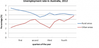
The line graph depicts the percentage of people in 2012 who have not found a job in Australia's rural and urban
areas
.
Use synonyms
Overall
, it is clearly apparent that in the village, the rate of people who are unemployed has slowly decreased. Linking Words
In contrast
, Linking Words
unemployment
rate in the city rocketed in the span of the fourth Add an article
the unemployment
quarter
of the year.
Turning to the detail, in the rural Use synonyms
areas
people who were jobless in the first Use synonyms
quarter
of 2012 were at their peak. it reached almost 7%, but in the next Use synonyms
quarter
, it slowly dropped to around 4%. Meanwhile, the employment rate in the urban Use synonyms
areas
is increasing from about 2% to 4%. It plummeted to just over 2% in the third Use synonyms
quarter
but suddenly escalated to its peak Use synonyms
in
the end of the period at almost 5%. In the case of rural Change the preposition
at
areas
, from the second to the fourth Use synonyms
Use synonyms
quarter
it fluctuated but hovered around 5% in the Add a comma
quarter,
last
Linking Words
quarter
of 2012.Use synonyms