
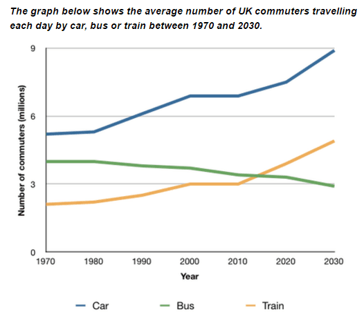
The line graph compares the mean quantity of British commuters using different
kind
of transportation every day from 1970 to 2030.
Fix the agreement mistake
kinds
Overall
, the usage of both cars and trains has an increasing tendency, Linking Words
whereas
bus statistics consistently Linking Words
decreases
Wrong verb form
decreased
during
the years. Change preposition
over
Additionally
, the same number of people Linking Words
traveled
by buses and trains in around 2015.
Change the spelling
travelled
To begin
, the most popular type of transport, during the whole period of time, was cars, starting from around 5 commuters a day in 1970. Linking Words
Then
, the number Linking Words
leaped
to 7 in 2000, staying unchanged till 2010, growing Change the spelling
leapt
further
to 9 in 2030.
Looking at the bus and car figures, it becomes obvious that it was more popular to utilise cars (about 5 travellers)Linking Words
,
than buses (just under 3) at the start of the period. Remove the comma
apply
However
, Linking Words
this
situation will be changed by 2030, where individuals will Linking Words
chose
trains, at 5 commuters, over buses, at slightly below 3 people per day.Change the verb form
choose