
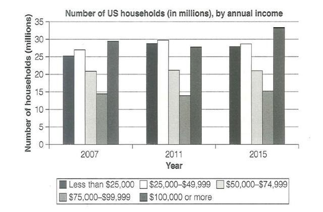
The given bar graph illustrates the yearly salary of US households between 2007 and 2015. Units are measured in millions.
Overall
, it can clearly be seen that despite the fluctuations, all categories showed no apparent changes, except for the less than $25,000.
Regarding the lowest category, the $75,000 income stood at just under 15 and persisted roughly around the same number until the Linking Words
last
year. Linking Words
Similarly
, the $50,000 category stayed at just above 20 throughout the observed periods. In terms of the highest starting level, Linking Words
the
$100,000 or more began at approximately 29 before slightly falling by roughly 3 in the following year. Correct article usage
apply
Finally
, it Linking Words
then
experienced an apparent rise and Linking Words
reach
a peak at 33 or so in 2015. Other than that, the $25,000 category and less stood at around 27 and exactly at 25 respectively, Wrong verb form
reached
then
both moderately grew to just below 30 in 2011 and remained at about 26 in the Linking Words
last
given period.Linking Words