
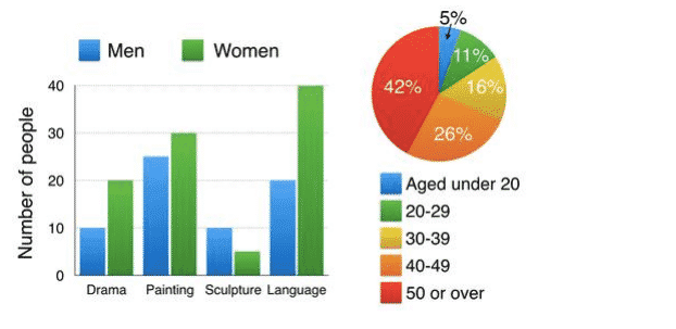
This
bar Linking Words
chart
depicts a comparison between female and Use synonyms
men
participating in different educational courses in 2009. The pie Use synonyms
chart
depicts the ages of all the attendees in the evening sessions. It is clear from the graph that in each course the women were higher than gentleman except in sculpture where the Use synonyms
men
were higher. Use synonyms
In addition
, the participants aged 50 or over were the greatest category in the education centre in 2009.
Linking Words
According to
what is shown in the bar Linking Words
chart
, the women in the language course were the top one about 40 women. At the same time, the Use synonyms
men
were around 20 which was the second biggest for them. Use synonyms
However
, in the sculpture lessons were the smallest by less than 10, Linking Words
also
the Linking Words
men
were 10.
As for the pie Use synonyms
chart
for ages, the attending who were 50 years or old took approximately 42% of the chairs of the centre. Use synonyms
Moreover
, whose ages under 20 were the lowest proportion nearest to 5 per cent in 2009Linking Words