
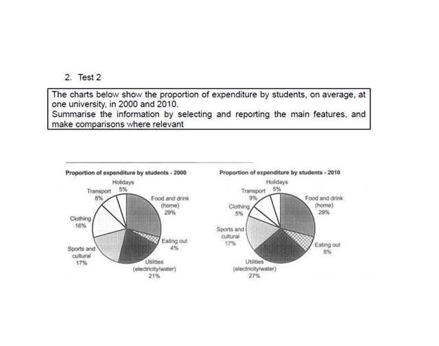
The two pie charts compare the percentage distribution of student spending at a single university in the years 2000 and 2010.
By far the biggest
expanses
are on food and utilities. Use the right word
expenses
In contrast
, students spend significantly less money on clothing over the ten-year period.
In both years, food and drink at home Linking Words
remaining
unchanged at 29%. Wrong verb form
remained
Similarly
, the proportion of Linking Words
budget
spent on holidays stayed constant Correct article usage
the budget
exactly
5%. Change preposition
at exactly
However
, the amount allocated to utilities grew noticeably from 21% in 2000 to 27% in 2010, becoming the Linking Words
second largest
cost. There was Correct word choice
second-highest
also
a slight rise in transport costs, which ticked up from 8% to 9%, Linking Words
while
the percentage for eating out doubled from 4% to 8%.
Linking Words
Conversely
, the most dramatic drop was seen in clothing, where spending plummeted from 18% to just 5%. Meanwhile, the figures for sports and cultural activities remained completely steady at 17% in both 2000 and 2010Linking Words
years
.Check wording
apply