
The both
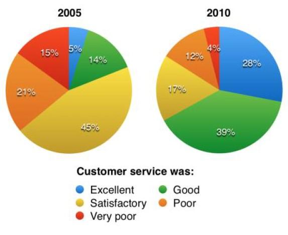
given pie charts illustrate the result of a survey about service asking 100 hotel visitors from travellers in Parkway Hotel. The data are available for the 5 years period between 2005 and 2010. There is a breakdown by 5 rate categories.
As a distinguishing quality,it can be clearly seen from the graph a good evaluation of the hotel service considerably increased over the whole period of study, from satisfactory to good and excellent.
Turning to the first pie chart, can be observed that approximately half of the consumers gave a satisfaction mark, 45% Correct article usage
Both
whereas
the poor and very poor rates came as the second category of rate, 21% and 15% respectively. As it was shown by the chart, individuals who gave excellent comments were only 5% it was twice less than good with 14%.
Taking a closer look at the second chart, as can be seen,satisfactory clients dropped to 17% Linking Words
while
customers with good and excellent marks were the highest three times than in previous research, 39% and 25%. Linking Words
Consequently
, customers with votes poor and very poor became twice fewer showing only 12% and 4%.Linking Words