
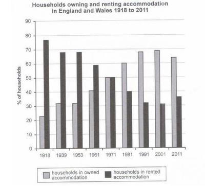
The bar chart Compares the rate of privately owned versus (against) rented
properties in England and Walse regions from 1918 to 2011.
Overall
, what stands out from the graph is that Linking Words
although
there was a gradual upward trend in the percentage of families who owned houses, the proportion of rented properties had a slow downward trend in the period of question except in 2011.
In detail, at the beginning of the 20th, about 80 per cent of accommodations were lent and Linking Words
then
In 1939, there was a steady drop to approximately 68%. The rate of rented Property in 1939 was the same as in 1939. After that, households in rented accommodation declined dramatically from 68% to just over30%. in 2001. In
2011, there was a slight improvement, up to 38%.
In controversy, the percentage of households in owned accommodation was the lowest (23%) in 1918. There was a slight increase to around 32%, Linking Words
then
levelled out in 1935. The proportion of owned houses rose to 68%, and in 2011, there was a slightly levelled off to 64%. in 2011. Linking Words
In addition
, the rate of households in owned and rented accommodation in England and Wales was the same in 1971, which was 50%.Linking Words