The pie charts below show units of electricity production by fuel source in Australia and France in 1980 and 2000.

The pie charts below show units of electricity production by fuel source in

Australia and France in 1980 and 2000.
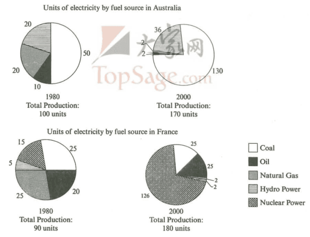
The pie charts exhibit
units
of electricity production by fuel source in Australia and France in 1980 and 2000.
Overall
,both countries had a rise in different categories of fuel
source
Fix the agreement mistake
sources
show examples
. Regarding the sources that Australia used,the most popular one was coal,which was 50
units
in 1980.Over 20 years,it got a significant rise;in 2000,it went up to 130
units
.Natural gas had the highest amount of decrease,though,going down from 20 to 2,respectively. Turning to France’s fuel sources,natural gas was the highest producer of electricity.In 2000,
nevertheless
,it became one of the lowest,dropping to
mere
Correct article usage
a mere
show examples
2
units
.In comparison,nuclear power went up to
whopping
Correct article usage
a whopping
show examples
126
units
,becoming the most popular one.
Submitted by asgerlituran35 on

Unauthorized use and/or duplication of this material without express and written permission from this site’s author and/or owner is strictly prohibited. Excerpts and links may be used, provided that full and clear credit is given to Writing9 with appropriate and specific direction to the original content.

Sentences: Add more complex sentences.
Introduction: The introduction is missing.
Introduction: Change the first sentence in the introduction.
Introduction: The chart intro is missing.
Common mistake: Your writing should be 150-250 words.
Introduction: The chart intro is missing.
Vocabulary: Rephrase your introduction. Words match: 80%.
Vocabulary: Replace the words units with synonyms.
Vocabulary: Rephrase the word "undefined" in your introduction.
Vocabulary: Only 5 basic words for charts were used.
Vocabulary: The word "went up" was used 2 times.
What to do next:
Look at other essays: