
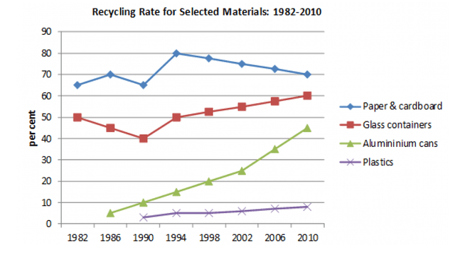
The given chart illustrates the percentage of four specific recycled materials between 1982 and 2010 in a particular nation.
Overall
, it can be seen that glass containers, Linking Words
aluminum
cans, and plastics experienced an upward trend Change the spelling
aluminium
while
paper and containers decreased. Linking Words
Additionally
, despite some fluctuations, paper and cardboard still maintained the highest position at the of the timeframe.
Looking at the chart, it can be evident that paper and cardboard began at around 65%, which was the highest proportion of the four materials at the beginning, before witnessing an upward fluctuation until it reached a peak at 80% in 1994. Linking Words
Then
it went down slowly to 70% in 2010. Linking Words
By contrast
, glass containers dropped rapidly to 40% in 1990 from 50% in 1982, but Linking Words
then
went up to 60% in the end.
With regards to the remaining data, the recycling rate of Linking Words
aluminum
cans was first recorded in 1986 at approximately 5% and rose noticeably to nearly 45%. Change the spelling
aluminium
Similarly
, plastics first appeared in 1990 at the lowest rates of four packaging items roughly 2%. After that, it showed a steady climb to 6% in 2002 and ended at about 8%.Linking Words