Depicted in the line graph is data about the population of citizens in the state of Oregon by county. Describe it.

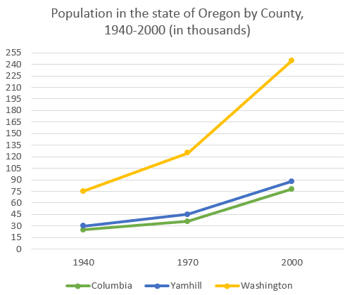
Depicted in the
line
graph is data about the population of citizens in the state
of Oregon by county. The data was observed in the years 1940, 1970, and 2000. Moreover
, the states that were observed were Columbia, Yamhill, and Washington
. The green line
is presenting Columbia, the blue line
for
Yamhill, and the yellow Add a missing verb
is for
line
is for Washington
.
Overall
, it can be observed that the population of each state
was increasing every year. The most significant increase was held by Washington
, its gap between the citizens in 2000 was almost twice as much as it was in 1970. Furthermore
, Washington
stays in its place as the highest amount of citizens amongst the other 2 states.
Another noteworthy aspect is the stable increase in the number of populations in Yamhill and Columbia. The state
with the blue line
had a 60 thousand gap between 1940 and 2000, while
the state
with the green line
had around 40 thousand gap in
between those years.Change preposition
apply
Submitted by arrafiv on
Unauthorized use and/or duplication of this material without express and written permission from this site’s author and/or owner is strictly prohibited. Excerpts and links may be used, provided that full and clear credit is given to Writing9 with appropriate and specific direction to the original content.
Introduction: The introduction is missing.
▼
Introduction: The chart intro is missing.
▼
Introduction: The chart intro is missing.
▼
Vocabulary: Rephrase your introduction. Words match: 100%.
▼
Vocabulary: Replace the words line, state, washington with synonyms.
▼
Vocabulary: Rephrase the word "data" in your introduction.
▼
Vocabulary: The word "data" was used 2 times.
▼
Vocabulary: The word "increase" was used 2 times.
▼