
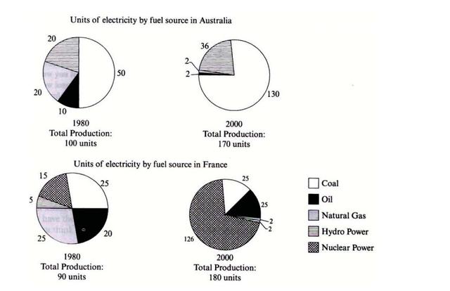
The pie charts display the proportion of electricity which was produced by fuel sources in two countries from 1980 to 2000.
Overall
, coal resources remained in the top place and there was a significant increase from 50 per cent to nearly 75 per cent in Australia. In France, natural Linking Words
gas
and coal shared the leadership in 1980, 25 Use synonyms
units
per each. Use synonyms
However
, a massive overtake was seen from nuclear power from 15 Linking Words
units
to 126 Use synonyms
units
, making a nearly eightfold jump.
Beginning with the highest rate was in 1980, when Australia produced 100 Use synonyms
units
and half of them were made from natural Use synonyms
gas
. Use synonyms
This
produce in France was a total of 90 Linking Words
units
and natural Use synonyms
gas
and coal were divided equally into 25 Use synonyms
units
.
In 2000, nuclear power was a popular resource among others, it contained 126 Use synonyms
units
out of 180, which were approximately 75 per cent of total production. Despite the amount of natural Use synonyms
gas
decreased, the proportion of coal remained constant.Use synonyms