
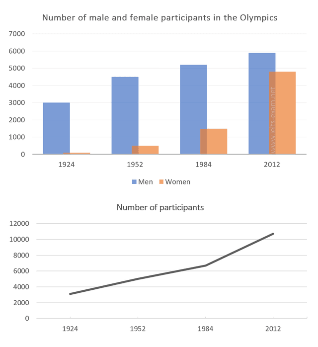
The two charts illustrate data on the number of participants in the Olympics in both total and different genders from 1924 to 2012.
Overall
, in all years the males have outnumbered the females .Linking Words
Although
, in 2012 female participants came close to the opposite sex.Linking Words
Furthermore
, both charts show a rapid increase in the period of 88 years.
As can be observed, males who entered the Olympics started at 3000 to reach slightly more than 4000 in 1952 and 5000 in 1984.Linking Words
Nonetheless
, it reached its peak in 2012 at almost 6000 participants.As for the females, they begin at low with almost none to getting above 1000 in 1984.After that, the numbers for them increased modestly to almost 5000 players in 2012.
Linking Words
Moreover
, Based on the second graph, the total of both genders was under four thousand in 1924.Linking Words
However
, the uptrend continued to reach 4000 entries to above 6000 in 1984.Linking Words
Nevertheless
, it reached its all-time high of above ten thousand attendants in 2012.Linking Words