
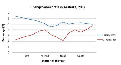
This
line graph provides the rate of individuals unemployed in Australia per Linking Words
quarter
of the year in 2012. Use synonyms
Overall
, Linking Words
it is clear that
the highest rate of unemployment was in Rural places in the first period, Linking Words
while
Urban Linking Words
areas
were the lowest.
It is interesting to notice that in the first Use synonyms
quarter
, Urban Use synonyms
areas
had approximately 2.5 unemployment, Use synonyms
Whereas
in Rural places was around 6.5 per Linking Words
cent
. The proportion of unemployment increased slightly in the first Use synonyms
quarter
. After that, there is a significant fall in the second Use synonyms
quarter
of the year. Use synonyms
Moreover
, Rural Linking Words
areas
had an increase in the same period. Use synonyms
For example
, it was almost 4.5 per Linking Words
cent
, Use synonyms
then
increased to nearly 5.5 per Linking Words
cent
in the following year. Use synonyms
In addition
, there was a considerable rise in the Uban Linking Words
areas
it was around 2 per Use synonyms
cent
, Use synonyms
then
became 4 per Linking Words
cent
in the same period.
In conclusion, the lowest rate was in Urban Use synonyms
areas
, but Rural places were the highest.Use synonyms