
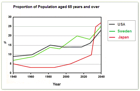
The given chart compares the demographic percentage of olds aged higher than 65 in three different nations from 1940 to 2040.
Generally speaking, it is apparent that each country’s proportions of old populations have increased in the
last
80-year period. Constantly, they are predicted to rise rapider in the following 20 years.
Focusing on the past 80 years, both the populational proportions of the elderly in the USA and Sweden have witnessed a general incline throughout the initial 50-year period, increasing by around 6% from roughly 9% and 7% in 1940 respectively, Linking Words
while
the figure in Japan remained under 5% over the same period until early 2000.
If we divert our attention to the future, there will be a dramatic increase in the data in Japan in the next 20 years, with the number standing at above 25% in 2040, which rose much Linking Words
rapidly
compared to the figures in the USA and Sweden that Correct quantifier usage
more rapidly
similarly
inclined by approximately 8% over the same time frame.Linking Words