
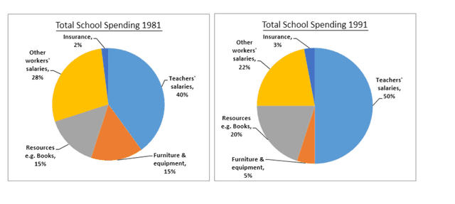
The three pie charts compare the proportion of expenditure where it went in 1981, 1991 and 2001,
according to
five sources( insurance, teachers' Linking Words
salaries
, furniture and equipment, other workers' Use synonyms
salaries
and other resources).
Use synonyms
Overall
, in all three years, a significant percentage of money was spent on teachers' Linking Words
salaries
, Use synonyms
while
insurance remained the smallest within the five categories.
To be specific, in 1981, expenditure on Linking Words
salaries
( teachers and other workers) was the main spending, with 40% and 28%, respectively. Use synonyms
However
, both witnessed an incremental change in two decades, the former fluctuated between 40% and 50%, and the latter decreased gradually from 28% to 15%.
Linking Words
On the other hand
, of all sources of spending, furniture equipment and resources accounted for the same volume of 15% Linking Words
initially
. Linking Words
Although
there was a significant drop in furniture and equipment in 1991, from 15% to 5%, it recovered notably to 23% in 2001. In terms of insurance, in comparison with other expenditures, the school spent the least money on it during the given years, with 2%, 3%, and 8%, respectively.Linking Words