
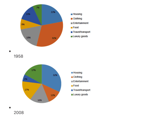
The pie chart given illustrates the percentage of
citizen's
expenditure on various fields involved in daily items and services in a European nation from over a fifty-year period from 1958 to 2008.
From an Fix the agreement mistake
citizens'
overall
perspective, it is evident that the proportion of consumption of housing, food, and luxury goods showed an upward trend, Linking Words
whereas
a reverse pattern could be seen in the figures for other categories over the years shown.
In 1958, the proportion of spending on clothing was the highest, at 32%. The data on accommodation and entertainment were lower, at 22% and 18%, respectively, compared to that of travel/transport and food, at 13% and 8%, in the given order. Luxury goods, Linking Words
however
, accounted for the lowest value, at 7%.
In 2008, the percentage of expenditure on both luxury goods and food significantly increased to 17%, Linking Words
similarly
, there was a sharp rise in that of housing to 32%. Linking Words
In contrast
, the data on clothing and travel/transport considerably decreased to 12% and 6%, respectively, in the final year. Linking Words
Moreover
, the budget for entertainment underwent a slight drop to 16% Linking Words
at the end
of the period.Linking Words