
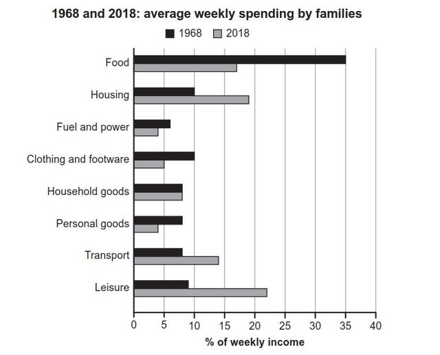
The provided bar chart illustrates the information on the expenditure in one week of the families, in two different years, 1968 and 2018. The data is given in percentages. In general, it is obvious to see that in 1968, people spent most of their money on food.
Whereas
in 2018, they tend to expenses more on leisure stuff.
First of all, in the year 1968, food was the highest spent, a mere 35%, which was nearly hit the peak. Another cost of living that the residents tended to buy was housing, clothing, and footwear, accounting for 10%. Linking Words
In contrast
, leisure, transport, personal goods, and household goods were the unpopular things to bring.
Linking Words
Besides
spending costs in 1968, in the 2018 period, leisure goods were the best seller at 22% over a week. Linking Words
Nevertheless
, housing and transportation costs were witnessed in the highest position, around 13%-19% respectively.Linking Words