
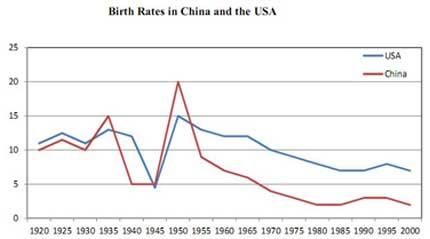
The line graph illustrates the birth rate difference between
China
and the United States from 1920 to 2000.
Use synonyms
Overall
, Linking Words
it is clear that
the number of newborns in the USA has been higher than in Linking Words
China
over the years. Use synonyms
Also
, it is shown that the two country's fertility rates had a similar downward trend since 1960.
Linking Words
Firstly
, in 1920, the States had a slightly more increase than Linking Words
China
which continued to follow the same tendency until the year 1928. Use synonyms
Then
the natality in Linking Words
China
rose greatly and decreased even more than that in the year 1937 Use synonyms
then
it levelled off for about 5 years. After that, the measurement of births in Linking Words
China
escalated fiercely from 5 to 20 in a five-year period. Again the fertility went down in 1952 and Use synonyms
then
it dropped stably until 1990. At that time, it began to grow again.
Linking Words
Secondly
, the estimation of newborns in America fluctuated for almost 20 years since 1920. Linking Words
Subsequently
the the ratio declined significantly and recovered which reached its peak in 1953. From that time the rate of birth descended thoroughly and started to see moderate expansion from 1987.Linking Words