
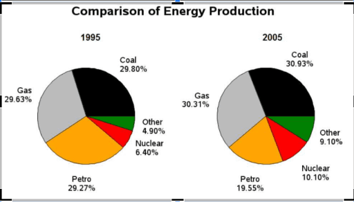
The pie charts show information about the manufacture of various
energy
in the nation during a 10-year period, starting from 1995.
Use synonyms
Overall
, it is discernible that coal and gas were two crucial energies, Linking Words
whereas
nuclear and 'other' were trivial elements in Linking Words
energy
Use synonyms
production
between 1995 and 2005.
A detailed glance at the pie charts reveals that coal, gas, and petrol had roughly equal percentages in terms of Use synonyms
energy
Use synonyms
production
, slightly above 29%, Use synonyms
while
in the following 10 years witnessed a gradual surge in gas and coal manufacture, nearly 31%.
Concerning the data, the proportion of petro Linking Words
production
declined steadily, representing just 19,55%. By 2005, approximately 5% of Use synonyms
production
was added in 'other' and nuclear Use synonyms
energy
, accounting for 9% and 10% respectivelyUse synonyms