
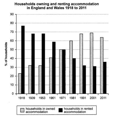
the bar chart illustrates the proportion of people who owned and rented houses in 2 countries from 1918 to 2011.
Overall
the data showed an increasing trend of households buying accommodation,Linking Words
in contrast
, there was a declining trend in renting homes,Linking Words
moreover
, in 1971, they were the same percentage and it was 50%
In the beginning, most citizens rented houses ,which reached 80%,Linking Words
in addition
, people who had their own house were only 20%. Linking Words
However
,from 1939 to 1953, it levelled off at 70% and 39% respectively .
Linking Words
Then
the percentage of renting apartments experienced a substantial drop from 58% in 1961 to 32% in 1991 , at the same time there was a dramatic growth in the figure for buying accommodation. Linking Words
Additionally
from 1991 to 2001 ,they stayed at 58% and 32% respectively.
Linking Words
Finally
, from 2001 to 2011 there was a decline in the owned accommodation, by 65%.Linking Words