
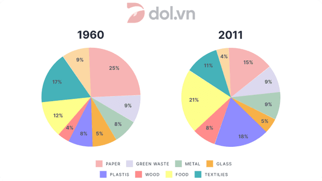
The diagram demonstrates some data regarding different kinds of waste disposed in a territory in two periods of 1960 and 2011.
Regarding the first year of record (1960), Paper held the first place at about 25
percent
and it was closely followed by Textiles. Change the spelling
per cent
In addition
, Wood had the Linking Words
last
position at around 4 Linking Words
percent
. Change the spelling
per cent
Although
Glass, Medal, Plastic and Green waste had almost the same ratio they are kept at middle values.
In regard to the second year of record which is 2011, Food exceeded the other Linking Words
contestant
but it was followed by Plastic. Fix the agreement mistake
contestants
Additionally
, Other had the Linking Words
last
place but it Linking Words
is
not far behind Glass.
Wrong verb form
was
Overall
, in comparison to the first year, the ratio of the Other has tripled. Linking Words
On the other hand
, the ratio of the Plastic and Wood has almost doubled. Linking Words
Furthermore
, Metal, Glass and Green waste kept their place and they did not change significantly. Linking Words
Consequently
, a few members kept their places but most of them had graduate increase in their values.Linking Words