
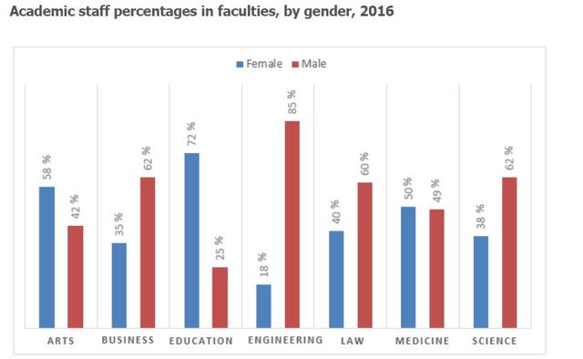
The graph illustrates the sex
proportion
of academic staff in seven faculties in 2016.
Use synonyms
Overall
, it is seen that the Linking Words
faculty
with the highest male Use synonyms
proportion
is Engineering, which is recorded at 85%. The least sought-after work for men is education. Use synonyms
This
was recorded at 25%. Linking Words
On the other hand
, the Linking Words
faculty
which is most popular with Use synonyms
females
is Education, which was 72% Use synonyms
while
in the engineering fields, Linking Words
females
showed the lowest popularity.
All Use synonyms
faculty
of Business, Law, and Science presented over 60% for Males in 2016 Use synonyms
while
the Linking Words
proportion
of Use synonyms
females
recorded less than 40%. The Use synonyms
proportion
of Use synonyms
females
working in the Use synonyms
faculty
of Arts and Medicine was less than 50%. The Use synonyms
faculty
which showed the slightest gap between women and men is the Use synonyms
Faculty
of Medicine. They just had a 1% difference between them.Use synonyms