
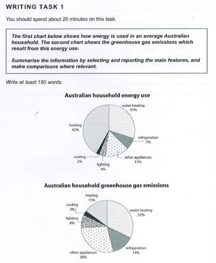
The pie charts illustrate the proportion of an
Australian
family using energy for various purposes and how much greenhouse gas is emitted by an average Use synonyms
Australian
family.
Use synonyms
Overall
, heating dominates the highest position in energy consumption, Linking Words
while
water heating took the lead in CO2 emitted by each Linking Words
Australian
household.
Use synonyms
According to
the first chart, it can be seen that 42% of the energy used by an average Linking Words
Australian
family is used for heating, which accounted for the highest place on the chart. Use synonyms
Following
Linking Words
this
are water heating and other appliances, at approximately 30% and 15%, respectively. Linking Words
In contrast
, the figures for refrigeration, lighting and cooling are the lowest, all below 7%.
As regards greenhouse gas released, water heating and other appliances are the major causes, at 32% and 28%, respectively. The percentage of heating and refrigeration emitted by an average Linking Words
Australian
house Use synonyms
are
lower, standing at about 15% for both. Cooling and lighting accounted for the lowest position, at below 8% for each.Change the verb form
is