The graph below gives information from a 2008 report about consumption of energy in the USA since 1980 with projections until 200 Summarize the information by selecting and reporting main features, and make comparisons where relevant.
IELTS Writing Task Chart for The graph below gives information from a 2008 report about consumption of energy in the USA since 1980 with projections until 200 Summarize the information by selecting and reporting main features, and make comparisons where relevant.
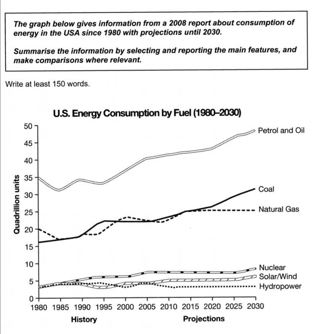
about the energy consumption by fuel since 1980 and gives some
projection
Fix the agreement mistake
projections
show examples
of it.
It is obvious that Petrol and oil stand
at the first stage
Linking Words
2762344380
Unauthorized use and/or duplication of this material without express and written permission from this site's author and/or owner is strictly prohibited. Excerpts and links may be used, provided that full and clear credit is given to Writing9 with appropriate and specific direction to the original content.
Sentences: Add more complex sentences.
▼
Linking words: Add more linking words.
▼
Basic structure: Write more paragraphs.
▼
Basic structure: Add more body paragraphs.
▼
Common mistake: Your writing should be 150-250 words.
Basic structure: Write more paragraphs.
▼
Vocabulary: Only 5 basic words for charts were used.
I am writing this letter to apply to be a part of your workforce. My name is Manish Sharma and I am 25 years old. I am a work permit holder in Canada with morethan 2years of validity. I live in Surrey near Stawberry Hill and my contact number is 604 658 6996.
Recently, workers have spent a large number of hours at workplace. Many people believe that companies should give their employees at least a month's holiday per year; in order to increase their productivity and creativity in their work. In my opinion, this development will have a positive impact on both employers and employees because workers will have more time to spend with their families and friends, which in turn can decrease their stress.
Lately, a plethora of topics are being seriously discussed amongst various individuals and groups, and the prominent one is that everybody should donate a fixed amount of their income to support charity. With several arguments to support it, I firmly agree with the statement given. This essay will list the reasons for my preference.
Some argue that the government should make significant investments in the local movie industry, shifting people's attention from international movies to domestic films. I partially agree with this assertion.
Critical geopolitics emerged in the 1980s and 1990s, shifting from classical geopolitics’ emphasis on geography as an objective reality to a focus on the role of language and discourse in shaping political perceptions. This approach recognizes that geographical knowledge influences how we define "us," "them," and "the enemy," and highlights how geopolitical discourses construct reality (Dittmer, 2014: 5). Critical geopolitics is divided into formal, practical, and popular branches, each contributing to our understanding of how geopolitical knowledge serves the state and its political agenda. Mahan’s focus on sea power and Mackinder’s broader vision of the geopolitical world (e.g., the "Heartland") contributed to geopolitics’ historical development, but their work, while significant, also reflects their desire to inform state policies (Dittmer, 2014: 15).