
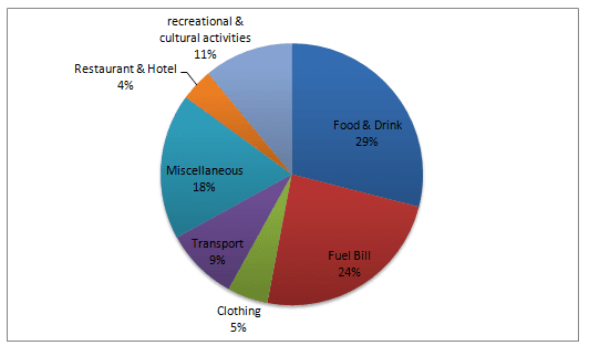
A glance at the figures provided reveals some striking differences in dedicating
money
to various items in an unknown European nation. Use synonyms
While
the first pie chart illustrates those preferences among the low-income group, the second one shows those preferences in the high-income group.
It is evident from the information gathered that low-income groups dedicating Linking Words
money
to food, drink and fuel prioritize other items as 29% and 24% of their income are spent on those items respectively. Having spent more than half the income on these issues, there remains a negligible amount of Use synonyms
money
at about 4% for eating out or purchasing clothes.
These preferences are significantly different in families with higher incomes. Obviously, the highest proportion of their income is dedicated to miscellaneous, recreational and cultural activities at 23% and 21% respectively. Use synonyms
Also
, transportation, food & drink and going to a restaurant or hotel are almost the second stage in their priorities Linking Words
whereas
the least Linking Words
money
is spent on fuel and buying clothes.Use synonyms