
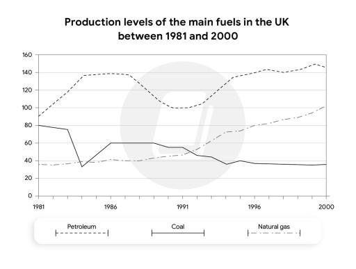
The line graph illustrates information about the production of three major categories of fuel in the UK from 1981 to 2000.
Looking from an
overall
perspective, it can be clearly seen that Petroleum was the most used in Linking Words
UK
throughout the Correct article usage
the UK
period
, Use synonyms
while
the opposite for coal was true. All types of Linking Words
the
fuel showed fluctuations from the beginning to the end of the Correct article usage
apply
period
.
Use synonyms
To begin
with, Petroleum was produced at the highest rate at almost 100 Linking Words
units
in 1981, it rose Use synonyms
140
Change preposition
to 140
units
Use synonyms
remained
stable for three years. It Correct word choice
and remained
then
dropped and picked up to 140 Linking Words
units
in 2000. Use synonyms
In contrast
, Natural gas witnessed an upward trend. It rose slightly from 40 to about 100 Linking Words
units
by 2000.
As for coal, the figure saw a downward trend. It had 80 Use synonyms
units
at the beginning of the Use synonyms
period
, it fluctuated and Use synonyms
then
decreased to Linking Words
aroun
40 Correct your spelling
around
units
Use synonyms
at the end
of the Linking Words
period
.Use synonyms