
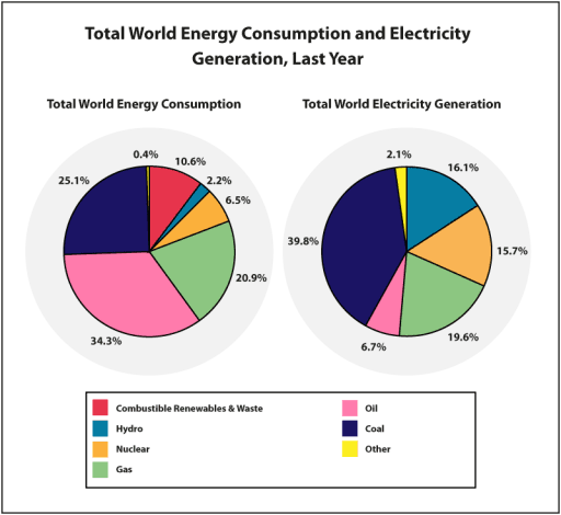
The two pie charts provide statistics about how much
energy
was generated and used Use synonyms
last
year. Units are measured in percentages.
Looking from an Linking Words
overall
perspective, it is readily apparent that the usage of Linking Words
oil
in Use synonyms
energy
consumption had the highest numbers, Use synonyms
while
coal showed a peak for power generation.
Moving to a more detailed analysis, Linking Words
oil
and coal experienced over half of Use synonyms
energy
use in total respectively 34% and 25%, followed by the second most preferred fossil fuel type which is gas at 20%. A sharp difference can be seen between the usage and production of Use synonyms
oil
and coal, just 14 under the trend for coal, Use synonyms
whereas
the figure for Linking Words
oil
was 5 times lower for Use synonyms
energy
production.
In terms of other means of power, renewables were at 10% in Use synonyms
energy
consumption, compared to 16% of Use synonyms
energy
creation with hydro technology which was used at 2%. Atomic Use synonyms
energy
accounted for 15% Use synonyms
in
the production process and made up roughly half of it for use, accompanied by other modes of Change preposition
of
energy
which represented the lowest proportions for both charts.Use synonyms