
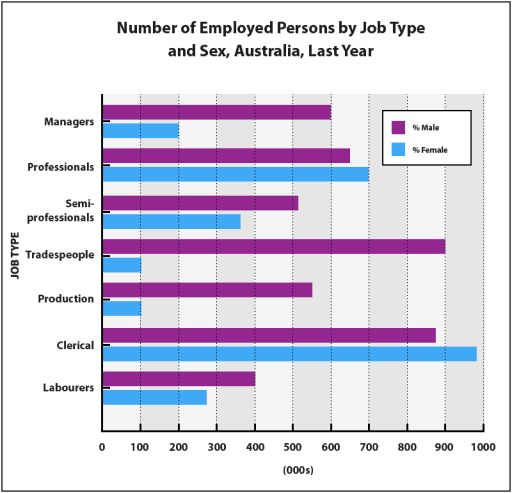
The bar graph provides statistics about how many people were employed
according to
their professions depending on gender in Australia Linking Words
last
year. Units are measured in thousands of people.
Looking from an Linking Words
overall
perspective, it is readily apparent that the trends for men were generally higher than women in virtually every occupation, except in professional jobs and clerical.
Moving to a more detailed analysis, male managers showed 3 times higher numbers than female directors respectively 600 and 200, Linking Words
while
semi-professionals and labourers experienced the same discrepancy between sexes, at nearly 400 and approximately 500 for the first and at precisely 400 and slightly under 300 for the latter.
In terms of other professions, the figures for tradespeople had the highest difference between ladies and gentlemen with exact numbers at 900 and 400, Linking Words
whereas
the proportions for production witnessed the second highest discrepancy at 550 for men and 100 for women. Females who worked in clerical had the highest data at roughly 1000, followed by males at almost 900 for a similar job.Linking Words