
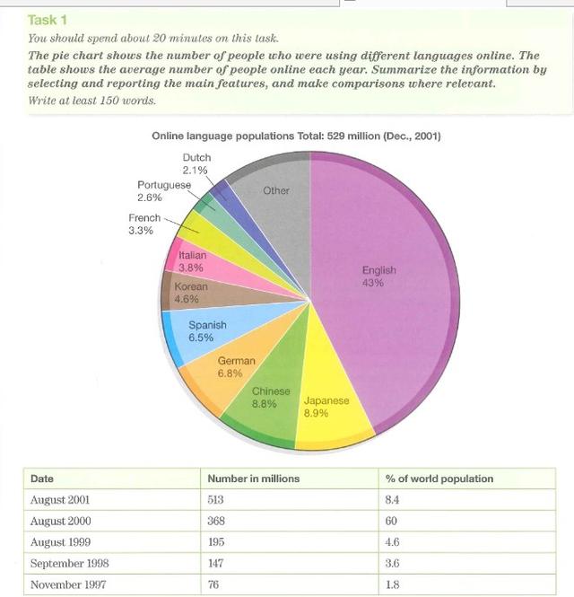
A glance at the pie chart provides the proportion of
users
of different languages on the Internet Use synonyms
while
the table Linking Words
reavels
the total user numbers and their percentages of Correct your spelling
reveals
revels
world
population.
Add an article
the world
Overall
, the vast majority of people used English online, whilst Dutch Linking Words
users
were the fewest. Use synonyms
Moreover
,the number of online Linking Words
users
skyrocketed from November 1997 to August 2001.
Use synonyms
According to
the information shown in the pie chart, there were 43% of online Linking Words
users
who used English which was 20 times more than Dutch ones by 2.1%.On Use synonyms
ther
other hand, there was a 1% gap between Japanese Correct your spelling
the
users
and Chinese Use synonyms
users
Use synonyms
which
the former was 8.9% and the latter was 8,8%.As for the total number of online Correct your spelling
with
users
, it experienced more than 6 times growth between November 1997 and August Use synonyms
200l
from 16 million people to 513 million people as its percentage of world population increased from 1.8% to 8.4%. What should be particularly mentioned is that the two years between August 1999 and August 2001 were the main period that the figure for online Correct your spelling
2000l
users
significantly increased by 318 million individuals.Use synonyms