
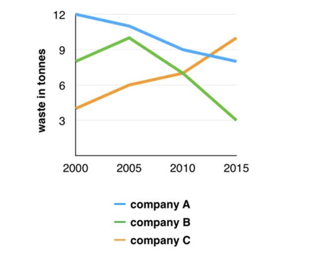
The line graph illustrates the amount of
waste
produced in three companies (A, B, and C) from 2000 to 2015, measured in Use synonyms
tons
.
Use synonyms
Overall
, Linking Words
while
Companies A and B saw a decrease in Linking Words
waste
production over the period, Use synonyms
Company
C experienced a significant rise.
In 2000, Use synonyms
Company
A was the biggest contributor, generating 12 Use synonyms
tons
of Use synonyms
waste
. Use synonyms
However
, Linking Words
this
amount steadily decreased, reaching 9 Linking Words
tons
by 2015.
Use synonyms
Conversely
, Linking Words
Company
B's Use synonyms
waste
production Use synonyms
initially
stood at 8 Linking Words
tons
in 2000 but rose to 11 Use synonyms
tons
by 2015 before ultimately declining to around 3 Use synonyms
tons
Use synonyms
at the end
of the period.
Linking Words
In contrast
to the other companies, Linking Words
Company
C started with the lowest Use synonyms
waste
production at approximately 4 Use synonyms
tons
in 2000. Use synonyms
This
amount doubled by 2005 and continued to rise, reaching 10 Linking Words
tons
in 2015Use synonyms