
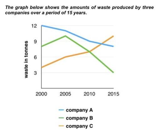
The diagram below illustrates the number of trash produced by 3 enterprises, A, B and C during 3 sessions, 2000-2005, 2005-2010 and 2010-2015.
Overall
, in 2000, company A was the main manufacturer that emitted the most rubbish, followed by other organizations, B and C Linking Words
subsequently
. Linking Words
Nevertheless
, in 2015, the third organization was letting the waste outside more than the rest.
Linking Words
Firstly
, company A was polluting a vast amount of trash at 12 tonnes Linking Words
while
the left enterprises were lower as commonly seen in the 1st period, Linking Words
however
, the interaction seemed to be realised and nature started getting conserved eventually.
Linking Words
Secondly
, in the 2nd and 3rd sessions, Company C became the only organization not aware of the problems produced during their process as others were reducing the pollution clearly, Linking Words
besides
that, it was at the peak Linking Words
at the end
at approximately 10 tonnes, Linking Words
nonetheless
, 1st organization realised about the troubles, so did the 2nd.Linking Words