
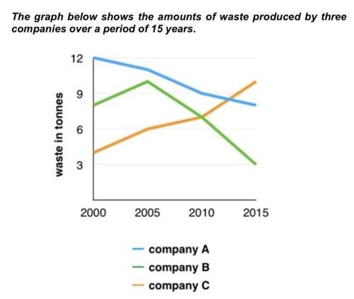
The provided line chart delineates the fluctuating ratios of rubbish production across various industries from the year 2000 to 2015. Notably, the data showcases distinct trajectories among the three manufacturers over
this
period.
Linking Words
Initially
, Linking Words
Manufacturer
A commenced with the lowest percentage of Use synonyms
waste
production in 2000, which swiftly escalated to 10% by 2015, marking a substantial increase. Use synonyms
Conversely
, Linking Words
Manufacturer
B exhibited a moderate start at 8% in 2000, Use synonyms
peaked
at 10% in 2005, before plummeting to 3% by the end of the observed period.
Meanwhile, Correct word choice
and peaked
Manufacturer
C held the highest proportion of Use synonyms
waste
generation at 12% in 2000. Use synonyms
However
, the office sector within Linking Words
this
Linking Words
manufacturer
demonstrated remarkable progress, transitioning from being the primary Use synonyms
waste
producer to a mere 8% by 2015, showcasing a consistent decline.
In summation, the data underscores the dynamic nature of Use synonyms
waste
production within these industries over the span of 15 years, with each exhibiting unique trends and patterns.Use synonyms