The line graph and pie chart below show information on crime in the UK for the last year. Summarise the information by selecting and reporting the main features, and make comparisons where relevant.

The line graph and pie chart below show information on crime in the UK for the last year.

Summarise the information by selecting and reporting the main features, and make comparisons where relevant.
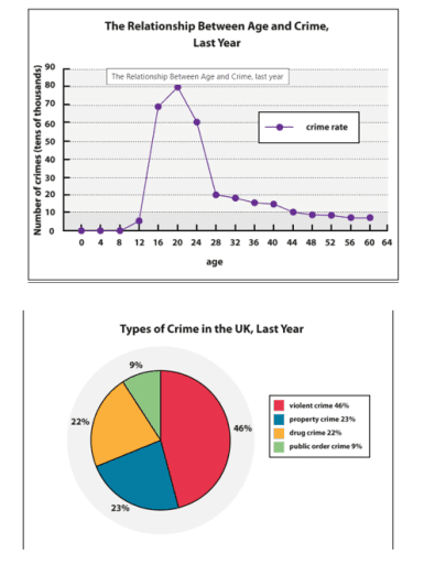
The graph provides statistics about the association between age groups and crime ratios and the pie chart gives data about the common types of wrongdoing in the UK
last
year. Units are measured in tens of thousands for the first and percentages for the latter. Looking from an
overall
perspective, it is readily apparent that the highest rates could be seen among adolescents,
while
the most common kind of violation was related to violence. Moving to a more detailed analysis, for the first 8 years of the people's life spans, the number of
atrocity
Fix the agreement mistake
atrocities
show examples
remained at 0, before starting to increase gradually from 8 to 12. From the age range of 12 to 20, the figure experienced a dramatic rise from approximately 7 to exactly 80, and
then
, witnessed a fourfold decrease from 80 to 20. In the adult stage of individuals' lives, the ratio of law violations fell back slowly to 5. In terms of certain types of lawlessness in the country, violent crimes accounted for roughly half of all the violations,
whereas
property and drug showed two times lower numbers than violence-related crimes at almost 25%, followed by the lowest proportion at 9 % for the public order type.
Submitted by writingbhos on

Unauthorized use and/or duplication of this material without express and written permission from this site’s author and/or owner is strictly prohibited. Excerpts and links may be used, provided that full and clear credit is given to Writing9 with appropriate and specific direction to the original content.

Vocabulary: The word "ratios" was used 2 times.
Vocabulary: The word "about" was used 2 times.
Vocabulary: Use several vocabularies to present the data in the second paragraph.
Topic Vocabulary:
  • The line graph depicts
  • The pie chart illustrates
  • reveals
  • displays
  • depicts
  • the trend of
  • the overall crime rate
  • steadily decreased
  • the distribution of
  • different types of crime
  • prevalent
  • accounts for
  • the most common crime
  • followed by
  • make up
  • a smaller proportion of
  • the total crimes
  • a smaller percentage
  • approximately
  • the remaining percentage
  • It is important to note that
  • reflects
What to do next:
Look at other essays: