
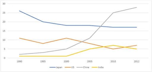
The
line
graph evidences numeral statistics regarding the Use synonyms
amount
of Change the quantifier
number
exportations
of Australia to four different countries.
Use synonyms
Overall
, we can see that the graph takes into consideration the period that starts from 1990 and ends Linking Words
up
in 2012. Change preposition
apply
Furthermore
, every country is not named, but they are represented by different coloured lines. It is evident that, for many years, the nation indicated with the blue Linking Words
line
has been the place which received more importations from Australia. Use synonyms
However
, from 2007, the red Linking Words
line
took the first place, covering around 28% of Australian Use synonyms
exportations
in 2012.
More detailed, the blue Use synonyms
line
indicates a nation that experienced a constant decrease from 1990 to 2012, where it received about 16% of Australian Use synonyms
exportations
. Use synonyms
In addition
, the country represented by the orange Linking Words
line
saw periods of up and down, which brought it to an Use synonyms
overall
decrease in percentage over the period analysed. Linking Words
Moreover
, from 2000 to 2012, the brown Linking Words
line
behaved in the opposite manner of the orange Use synonyms
line
. Before that year, it faced a steady amount of Use synonyms
exportations
received from Australia.Use synonyms