
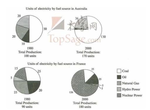
The pie charts illustrate the distribution of
fuel
products in Australia and France between 1980 and 2000. Use synonyms
This
essay will analyze the trends and details presented in the charts.
During Linking Words
this
period, the number of Linking Words
units
of electricity generated by Use synonyms
fual
in Correct your spelling
fuel
Australia
Correct your spelling
Australian
that
Correct word choice
apply
the
Coal increased significantly from 50 to 130. The Correct article usage
apply
production
of Use synonyms
oil
and natural Use synonyms
gas
declined dramatically from 20 and 10 to 2, respectively. It is Use synonyms
also
worth noting that Linking Words
the
nuclear Correct article usage
apply
power
increased from 20 Use synonyms
units
to 36 Use synonyms
units
, but the percentage of nuclear Use synonyms
power
remained almost unchanged. Use synonyms
This
is because the total electricity Linking Words
production
, measured in Use synonyms
units
, increased from 100 to 170. The number of Use synonyms
units
of electricity generated by Use synonyms
fuel
in France is 25 Use synonyms
units
. The Use synonyms
oil
increased from 20 to 25. The natural Use synonyms
gas
and Use synonyms
hydro
Correct your spelling
hydropower
power
decreased from 25 and 5 to 2 each. Use synonyms
In addition
, nuclear Linking Words
power
grew from 15 to 126, becoming the main source of Use synonyms
fuel
Use synonyms
production
in France in 2000.
In 1980, Use synonyms
fuel
Use synonyms
production
in Australia. Use synonyms
The coal
took the lead, followed by Correct article usage
Coal
hydro
Correct your spelling
hydropower
power
and natural Use synonyms
gas
, with Use synonyms
oil
coming in Use synonyms
last
. After 20 years, coal still had the largest share, but it was surpassed by natural Linking Words
gas
in Use synonyms
hydro
Correct your spelling
hydropower
power
generation. Use synonyms
However
, natural Linking Words
gas
and Use synonyms
oil
came in Use synonyms
last
.Linking Words