
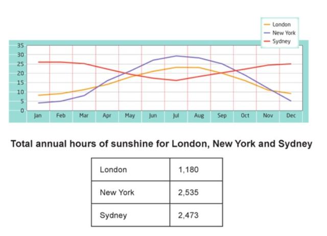
The line graph illustrates information about monthly heating proportion and table despite the numerical of hours of sunrise per year in main states in three different countries,namely the United Kingdom,U.S.A ,and Australia.
Overall
, beging of the year a significant percentage was represented by Sydney and end of the year Linking Words
also
it remained the same.Linking Words
while
New York and London cities fluctuated and decided in the Linking Words
last
month.
Linking Words
According to
the graph, in the month of January around 25 Linking Words
temperature
.Remain the same in the first three months and gradually dropped and hit the lowest Use synonyms
temperature
of nearly 15.Middle of July again slightly went up and stabilized in 25 heat.
Use synonyms
Moreover
, London and Sydney both cities show under 15 proportions of Linking Words
temperature
between January and March.It was a moderate climb and New York accounted for the highest heat contribution in July of exactly 30.After July slowly dipped and end of the month there was recorded approximately just below 10 Use synonyms
temperature
.
Use synonyms
Furthermore
,New York was made up of the most sunshine Linking Words
city
yearly and the lowest was London .Those were 2535 and 1180 respectively.Fix the agreement mistake
cities