
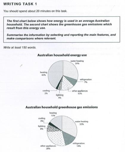
The pie chart portrays the average energy consumption in an Australian household. The second diagram illustrates the greenhouse gases emitted from the energy used up.
In an Australian home, the majority of energy is used up by heating (42%).
This
is followed by water heating (30%) and other appliances at 15%. A minority of activity is in refrigerating (17%) Linking Words
,
and lighting (4%). The minimal activity is 2% in cooling.
The highest volume of emission on average in an Australian housing is from heating ,which is at 32%. The least fraction is emitted at 3% by cooling. The greenhouse gas emissions from heating are moderate at 15%, despite having the highest proportion of consumption. Refrigeration and lighting have twice the result as the consumption at 14% and 8%, relatively.Punctuation problem
apply