
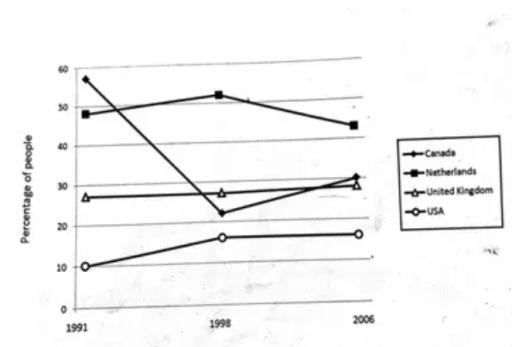
The given line chart illustrates the comparison of the
level
of Use synonyms
satisfaction
with the health care Use synonyms
system
of people in four countries Use synonyms
Canada
, the UK, the Netherlands and the US Punctuation problem
, Canada
between
1991 and 2007
Punctuation problem
, between
Overall
, as can be clearly seen from the graph, there were significant changes in the Linking Words
level
of Use synonyms
satisfaction
of people in these countries with the Use synonyms
healthcare
Use synonyms
system
. The Use synonyms
level
of Use synonyms
satisfaction
with the Use synonyms
healthcare
Use synonyms
system
in the UK and Use synonyms
US
tends to rise, Correct article usage
the US
while
the opposite trend was true in Canada and Linking Words
Netherlands
.
In Canada, there was Correct article usage
the Netherlands
significant
fluctuationCorrect article usage
a significant
, in
Punctuation problem
. In
1991
the figure stood at around 60% and over the following 7 years, the data of the Punctuation problem
1991,
healthcare
Use synonyms
system
plummeted sharply Use synonyms
around
20% by 1998Change preposition
to around
, and the
Punctuation problem
. The
healthcare
Use synonyms
system
experienced a moderate increase from 20 to 40 Use synonyms
percent
from 1998 to 2007.
In the Netherlands, it can be seen from the chart that there was a slight drop from approximately 49% in 1991 to 47% in 2007. The figures in the UK show that the Change the spelling
per cent
level
of Use synonyms
satisfaction
with the Use synonyms
healthcare
Use synonyms
system
tended to rise over a period of 16 years Use synonyms
from
21% in 1991 and increased steadily to around 29% in 2007. Meanwhile, the figure for the US increased slightly from approximately 10% to 11% over the period.Punctuation problem
, from