
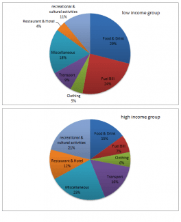
The charts give information about the proportion of gains spent on different items in one European nation. We can see two pictures: the first figure refers to a group of people with a low income, opposite to the
second
one, where they have earned more money.
The first difference is evident on food and drink bought: in the pie-chart on the left, the percentage is bigger than the one on the right, with a waste of 14%. At the same time, the quantity of money used for restaurant or hotels rises in the rich people, it is almost 12% against the four percentage points of the poors; Linking Words
therefore
, in Linking Words
this
was, globally, the gains spent to eat are approximately the same.
Linking Words
Furthermore
, another aspect is the cultural activity, in fact, the group with a lot of coins spends just over a fifth of their oof, Linking Words
while
the other group uses half.
Linking Words
Moreover
, Linking Words
to conclude
, the Linking Words
last
comparison, is around the means of transport: the poors drive by own car, as a matter of fact, the level of fuel bills is greater than the transport using, in meanwhile the opposite is observed in the rich people.Linking Words