
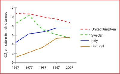
The line graph reveals striking information about the average
carbon
Use synonyms
dioxide
Use synonyms
emissions
per person in four different countries over a period of 40 years.
Use synonyms
Overall
, the Linking Words
carbon
Use synonyms
dioxide
emitted by Use synonyms
Correct article usage
the United
United
Correct article usage
the United
kingdom
remains the highest between 1967 to 2007. Use synonyms
Also
, Linking Words
United
Correct article usage
the United
Use synonyms
kingdom
and Sweden saw a considerable decrease in their Change the capitalization
Kingdom
carbon
Use synonyms
dioxide
Use synonyms
emissions
, Use synonyms
in contrast
, Italy and Portugal increased their Linking Words
carbon
Use synonyms
dioxide
Use synonyms
emissions
during these 40 years.
In the year 1967, Portugal emitted nearly 1 metric tonne of Use synonyms
the
Correct article usage
apply
carbon
Use synonyms
dioxide
, Use synonyms
however
, in comparison, Linking Words
United
Correct article usage
the United
kingdom
emitted 12 times more Use synonyms
carbon
Use synonyms
dioxide
. By 2007, Use synonyms
carbon
Use synonyms
dioxide
emitted by Use synonyms
united
Correct article usage
the united
kingdom
plunged to nearly 9 metric tonnes and a contrasting trend was followed by Italy and Portugal where the Use synonyms
emissions
Use synonyms
were
increased by 2-5 metric tonnes Unnecessary verb
apply
overall
.
Another interesting fact highlighted by the charts is the fact that Linking Words
although
, in 1967, Sweden's Linking Words
carbon
Use synonyms
dioxide
Use synonyms
emissions
were nearly 9 times Use synonyms
of
Portugal's, by the year 2007, both Change preposition
apply
the
countries produced the same amount of Correct article usage
apply
carbon
Use synonyms
dioxide
.Use synonyms