
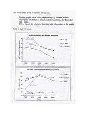
The provided line graph illustrates the information in context to how many people smoked in different countries;
whereas
, the level of consuming liquor was changed throughout the period (1960-2000) is depicted by Linking Words
second
chart.
From my Linking Words
overall
analysis, the striking feature was concerned in the Holland on both cases: percentage of people who smoke every day and drink consumption.
Glancing at providing illustration, it can be seen thoroughly, in the initial year (1960), nearly 60% people were smoking in the Holland. After that, Linking Words
this
figure decreased continuously from 1970 to till 2000, that was recorded at 35%. Linking Words
Moreover
, in the Japan and the USA, the rate of taking smoke was the lowest in 1960, Linking Words
that is
, 40-50%. Linking Words
Thereafter
, both figures were followed downward trend, and the values were reached at the trough point (approximately 18% in the USA and 33% in the Japan).
Having a quick glance towards the Linking Words
next
graph, only seven litre liquor was used by USA citizens in 1960. It continues inclined between 1960 and 1980, and in 2000, the value declined with a small difference: by two. Linking Words
However
, the lowest figure was noticed by the tax during the period: 1-2 litre. The consumption level of alcohol rose higher from 1960 to 1980 (4 to 11 litre) in the Holland.Linking Words