
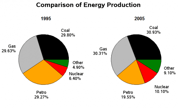
The pie chart illustrates different kinds of energy produced in France in 1995 and 2005.
Overall
, a glance at the chart reveals that different variations are evident. At the beginning of the period producing coal was the most significant sector Linking Words
as well as
Linking Words
at the end
of the period. Linking Words
On the other hand
, Petro declined steadily from 1995 to 2005.
The coal sector accounted for 29.80% of Linking Words
France
energy production in 1995 and experienced a more than 1per cent increase to 30.93% in 2005. Manufacturing gas made up 29.63% in 1995 and witnessed a slight increase to 30.31% in 2005.
At the beginning of the energy-producing period, nuclear reproduction and other constructions were 6.40% and 4.90, respectively, Change noun form
France's
Correct word choice
and went
went
up gradually to 10.10% and 9.10% in 2005. Petro, which compromised almost less than a Wrong verb form
going
third
in 1995, fell to 19.55% in 2005.
All in all, Linking Words
Although
there was a slight increase in most of the segments, petro experienced an opposing situation.Linking Words