
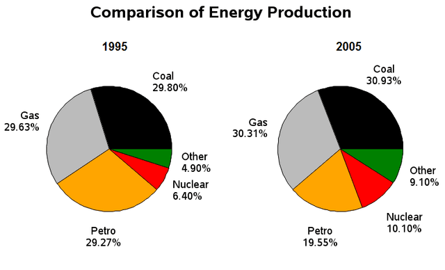
The two pie charts provide the percentages of several types of fuel consumed by the population in the United Kingdom in the years 2000 and 2010.
Overall
, it can be seen from the pie charts that people used less fuel of petroleum spirit in the Linking Words
last
period, Linking Words
while
other Linking Words
fuels'
consumption increased slightly.
It is apparent that the proportion of expenditure on fuel resources by people, which coal Change noun form
fuels
energy
consumed, was the highest, beginning at 30% in the year 2000 and gradually increasing by 1% after a decade, followed by gas at 29.5%. Use synonyms
Similarly
, 6.5% and 5% of all Linking Words
energy
were Use synonyms
initially
solar and other Linking Words
energy
, respectively, after which both figures rose gradually to 10% and 9% in the final year.
Use synonyms
On the other hand
, the percentage of the Linking Words
energy
resources of petrol that people consumed made up 29% in the year 2000, and Use synonyms
then
experienced a significant decline to 20% by the end of 2010.Linking Words