
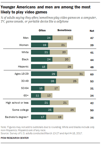
The bar chart illustrates the number of video gamers, who were younger Americans in 2017 by a variety of classes which are by sexual, race, age or school degree. As a whole, all categories had around half ratio, as for frequency whichever often or sometimes.
Ages
18 to 29 had the highest share, Use synonyms
whereas
over 65 people had the lowest share.
When it comes to the Linking Words
ages
, Use synonyms
ages
18 to 29 proportion was the biggest percentage which was the sum of 60% which were often and sometimes, 29 and 31, respectively. Use synonyms
However
, those over 65 Linking Words
ages
, they were only 24% in total. Use synonyms
Therefore
, the difference between 18 to 29 and over 65 was 36% in total.
As a side note, other departments did not have notable differences. Even though, by sexuals, race or school degrees, the graph depicts around 40% of people that enjoyed playing video games. That frequency was about 20% for each section.Linking Words