
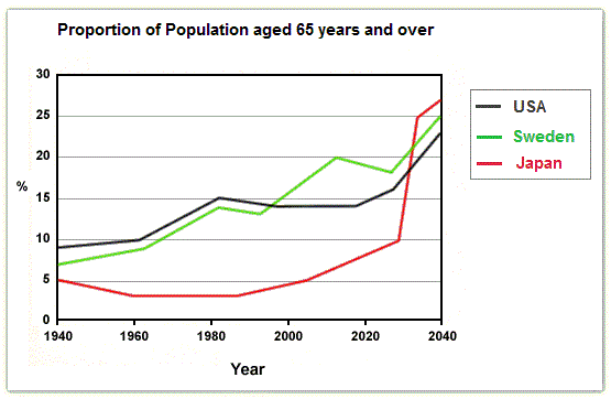
The ratio of elderly people aged 65 or above is expected to change over a hundred-year period, from 1940-2040, and the given line graph captures
this
transition in three countries USA, Sweden and Japan.
At the beginning of 1940, only 5 out of every 100 Japanese citizens were aged 65 or beyond, but by the end of 1960, Linking Words
this
fraction Linking Words
further
reduced to 3 and remained the same until the late 1980s after which Linking Words
a
marginal growth was seen till 2000. Meanwhile, between 1940-1960, the percentage of senior citizens slightly increased from 9% to 10% and 7% to 9%, respectively in the USA and Sweden. Both these countries Correct article usage
apply
then
showcased a similar steady rise over the next two decades ending with 15% and 14% old age people.
In the 21st century, there was a noticeable surge in the proportion of Linking Words
Swedish
old age Correct article usage
the Swedish
population
, increasing from 15% in 2000 to 20% in 2015, followed by a cool-off period in the subsequent years. During the same duration, America’s elderly Use synonyms
population
proportion flattened out Use synonyms
at
14%, only to see a gradual growth from the start of 2018. Change preposition
to
Whereas
, in Japan, Linking Words
this
Linking Words
population
Use synonyms
numbers
have ascended steadily since 2000, and it is expected to skyrocket in a space of Fix the agreement mistake
number
few
years from 10% in 2030 to 25% in 2035 and 27% in 2040. Correct article usage
a few
Similarly
, it is projected that the proportion of old age citizens can surge up to 25% and 23% in USA and Sweden respectively.
Linking Words
Overall
, a generic upward trend is observed in the percentages of Linking Words
senior
Add an article
the senior
population
, and based on the estimates elderly will account for a quarter of the human species in the coming years.Use synonyms