
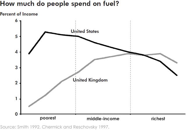
The
graph
reflects the relationship between the Use synonyms
income
percentage of people residing in the US and the UK with expenditure on Use synonyms
fuel
. Three classes including the poorest, middle-Use synonyms
income
men and the richest are mentioned on the Use synonyms
graph
.
Use synonyms
Overall
, the ratio is inversely proportional for people living in the US. A poor person spent more than 5% of his total Linking Words
income
on Use synonyms
fuel
which is the peak point for people of all sorts of Use synonyms
income
Use synonyms
whereas
, a person belonging to Linking Words
privileged
class spent Correct article usage
the privileged
least
amount of his Change the article
the least
income
which is close to 2%.Use synonyms
On the contrary
, the Linking Words
graph
is directly proportional to the population of the UK. The Use synonyms
graph
for Use synonyms
fuel
cost increases with respect to Use synonyms
income
.
It is clear from the data that for the UK,the lowest expense on Use synonyms
fuel
is somewhat close to 0.5% of a poor person’s Use synonyms
income
.The expenditure ,Use synonyms
however
, dwindles between 2.5% to approximately 4% for a middle-class man Linking Words
whereas
, for the upper class it remains between 3% to 4% of a person’s total Linking Words
income
.Use synonyms
On the other hand
, the ratio is the opposite for residents of the US where 4% to approximately 5.5% of a poor man’s Linking Words
income
goes on Use synonyms
fuel
expenses ,unlike the upper class where they spent only 2 % of their total Use synonyms
income
on Use synonyms
fuel
.Use synonyms