The chart below give the number of people employed in five types of work in a certain region in Australia in 2001 and 2008. Summarise the information by selecting and reporting the main features, and make comparisons where relevant.

The chart below give the number of people employed in five types of work in a certain region in Australia in 2001 and 2008. 

Summarise the information by selecting and reporting the main features, and make comparisons where relevant.
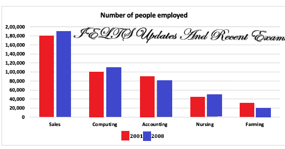
The bar chart given offers insights into how many people were recruited in five specific spheres, involving sales, accounting, computing, nursing, and farming in a particular Australian area over a period of 7 years, from 2001 and 2008. From an
overall
perspective, the most striking feature is that the sales sector held the predominant number of employees taken on
while
the opposite is true for farming. Meanwhile, almost all fields witnessed a slight upward trend, except for accounting and farming. It is
also
evident that there was a remarkable discrepancy between the sales major and the four others.
Submitted by lpnthanh on

Unauthorized use and/or duplication of this material without express and written permission from this site’s author and/or owner is strictly prohibited. Excerpts and links may be used, provided that full and clear credit is given to Writing9 with appropriate and specific direction to the original content.

Basic structure: Write more paragraphs.
Basic structure: Add more body paragraphs.
Common mistake: Your writing should be 150-250 words.
Basic structure: Write more paragraphs.
Vocabulary: Rephrase the word "give" in your introduction.
Vocabulary: Only 6 basic words for charts were used.
What to do next:
Look at other essays: