
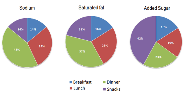
The pie charts compare the share of 3 different kinds of possible unhealthy ingredients in every meal, namely sodium, saturated fat, and added sugar. Units are measured in percentages.
Looking from an
overall
perspective, it is readily apparent that breakfast is the meal that includes the smallest proportion of these nutrients, Linking Words
whereas
dinner has the lowest amount of sodium and saturated fat and the second amount of added sugar.
In the first diagram, it is observed that snacks and the first meal of the day have the same proportion regarding containing sodium which is 14%. Linking Words
Moreover
, dinner become the most salt-included meal with 43%, followed by lunch with 29%. Linking Words
According to
the second picture, snacks and lunch have a similar percentage of holding fat and together they account for approximately 50% of all sharing. The first meal and the Linking Words
last
meal comprise the remaining 50% in terms of fat inclusion. The third graph reveals that snacks represent 42% of sugar holding and in comparison with the other three, it is the largest proportion. The other 58% is composed of breakfast, dinner, and lunch which share 16%, 23%, and 19% respectively.Linking Words