
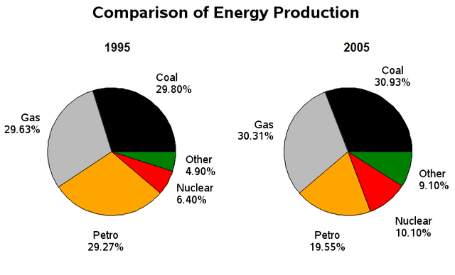
The pie chart compares the consumption of various kinds of
energy
in the UK in two Use synonyms
years
. Use synonyms
Overall
, the production of Gas and Coal has slightly changed through the Linking Words
years
, Use synonyms
while
there's a remarkable switch in Linking Words
percentage
of the others types of Add an article
the percentage
energy
.
Looking into more details, in 1995, the UK relied the most on Gas and coal production, the percentage of both was similar with a 0,27% difference, and after 10 Use synonyms
years
, the proportion of both increased slightly accounting for 30,31% for Gas and 30,93% for Coal. Use synonyms
This
is followed by the production of Petro which remained in third place in both Linking Words
years
, Use synonyms
however
, it decreased from 29,27% to 19,55% between 1995 and 2005. The UK in 2005 relied more on the consumption of nuclear Linking Words
energy
which saw a notable increase from 6,40% to 10,10%.
In conclusion, the consumption of different kinds of Use synonyms
energy
has changed after 10 Use synonyms
years
and there was more dependency on other types of Use synonyms
energy
in 2005 (9,10%).Use synonyms