
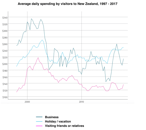
The graph illustrates how much an average visitor in New Zealand spent daily in the period from 1997 to 2017. Over
this
span of 20 years, it can be seen that the differences between expenditures tended to be less irrespective of the cause for visiting Linking Words
this
country.
Before 2010, the amount of money spent was most seen with business guests as they spent almost 340$ a day. Linking Words
In contrast
, people who visited relatives were able to give up to 220$ on daily basis. Vacation visitors were in between with 260$ spent daily as an upper limit.
After that date, the expenditure trends between Holiday and Trading visitors didn't show much variance. Especially with the falling expenditure habits noted in the Linking Words
last
group. In fact , the graph shows that the daily budget for Holiday-makers was more and reached 240$ in 2017.
Linking Words
On the other hand
, Relative-visiting guests didn't spend much money Linking Words
at the end
of the shown period with an amount of 130$ daily.Linking Words